ATS-Friendly Resume Formats: What Breaks Parsers and What's Safe
The formatting half of beating an ATS. Which layout, font, heading, date, and export choices parse cleanly, which are risky, and which break parsers outright, with a verdict and a one-line reason for each.
A resume can have perfect content and still lose to the parser on layout alone. Before a tracking system scores your experience or matches your keywords, it has to extract the text from your file, and a layout it can't read produces a file with no readable words to score. The formatting decisions below sit upstream of everything else: get them wrong and the best-written resume in the queue never gets read.
This is the format half of beating an applicant tracking system. The language half, how to mirror a job description's keywords, is in ATS keyword optimization; the full parser mechanics are in the ATS resume guide. Here, every common design choice gets a verdict: safe, risky, or breaks parsers, with the one-line reason why.
Formatting fails at the first step: text extraction
To see why a choice is safe or fatal, you need the one fact about parsers that every formatting rule derives from. Each applicant tracking system does three things in order: it extracts the text from your file, maps that text into fields (name, experience, education, skills), and scores the fields against the job. Formatting breaks the first two steps, and the first is unrecoverable.
Text extraction is the parser opening your PDF and pulling the words out. It fails when the words aren't really words: text baked into an image, characters flattened into vector outlines by a design tool, or a layout the extractor reads in the wrong order. When extraction fails, nothing downstream sees what you wrote. Field mapping is the parser slicing the extracted text into sections, using your headings and layout as cues. It fails when your headings aren't the ones it expects, or your columns confuse the reading order, and the result is your experience filed under the wrong field or dropped.
Every verdict below is a prediction about those two steps. Safe means both survive the choice. Risky means one of them sometimes fails, depending on the system. Breaks parsers means one of them reliably fails.
Columns and layout
Layout is where the most common fatal mistake lives, and it's the choice most resume templates get wrong in the name of looking modern.
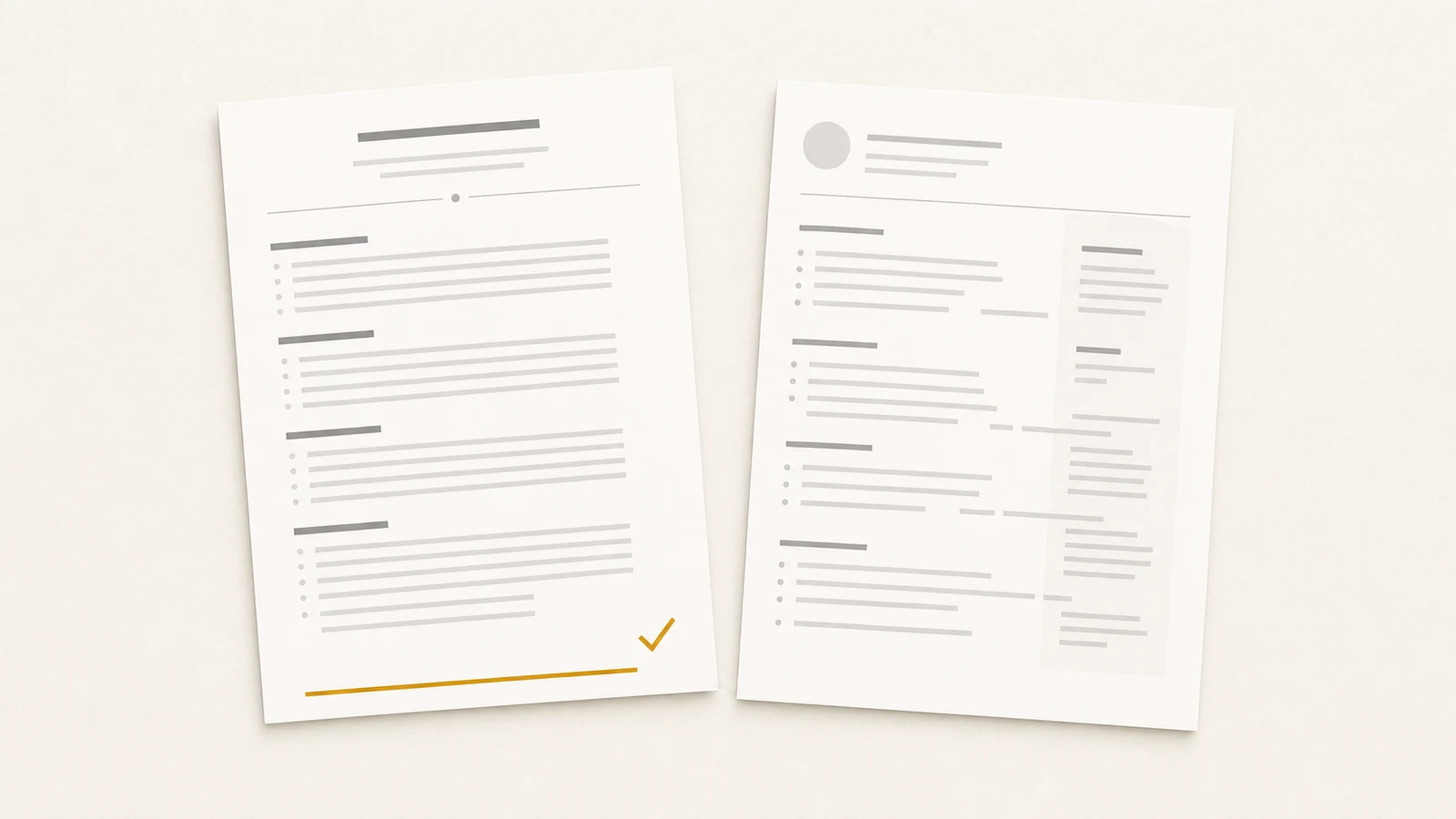
The reading order is the whole problem. A parser reads a PDF roughly the way a screen reader does, following the document's internal text order, which is not always the visual order you see. A clean single-column document has one unambiguous order: top to bottom. A two-column document has two, and the parser frequently interleaves them, reading a line from the left column then a line from the right, producing scrambled output where your job title collides with a skill from the sidebar. Tables compound it: many parsers treat each cell as a separate field, so a skills grid becomes a set of orphaned fragments and a table used for the whole page shreds the reading order.
| Choice | Verdict | Why |
|---|---|---|
| Single column, top to bottom | Safe | One unambiguous reading order every parser follows. |
| Two columns | Breaks parsers | The parser interleaves the columns or drops one, scrambling fields. |
| Sidebar (skills or contact in a side panel) | Breaks parsers | The panel parses out of order or lands in the wrong field. |
| Table used for page layout | Breaks parsers | Cells read as separate fields; reading order is lost. |
| Table for a skills grid | Risky | Some parsers read each cell as its own field, orphaning the terms. |
| Plain horizontal rule between sections | Safe | A divider line carries no text and doesn't affect extraction. |
The fix is geometric, not aesthetic: put everything in one column, in the order you want it read, and let the page run top to bottom. If you have a designed two-column version you love, keep it for the human-facing web page where a person reads it directly. The file you upload to the portal is the single-column one.
Fonts and sizes
Typography rarely breaks extraction outright, but the wrong choices push a file from clean into risky for a design payoff that doesn't survive the parser anyway.
Standard system-installed fonts: safe. Arial, Calibri, Helvetica, Times New Roman, Georgia, Inter, Source Sans. They render and embed predictably, and the parser has no trouble with their character shapes. There's no parser-side benefit to anything more exotic, because the recruiter's first look at your file is often the parser's plain-text extraction, where the font doesn't exist at all.
Downloaded or decorative fonts: risky. A font the system has to download can fail to embed in the PDF, and when it doesn't embed, the viewer substitutes a default that sometimes maps characters incorrectly, turning a clean line into garbled glyphs the parser then extracts as garbage. Display fonts with unusual ligatures or condensed letterforms raise the failure rate. The upside is real on screen and gone the moment the file is parsed.
Body text at 10 to 12 point: safe. Standard, readable, and large enough that any OCR fallback handles it cleanly. Body text under 10 point: risky. Shrinking the font to cram in more content hurts the human reader and, on the occasional parser that falls back to OCR, raises the character-error rate. Headings can run larger, 14 to 18 point; the floor is what matters.
One more, often overlooked: keep your contact details as live text in the body of the document, not inside the page header or footer. Several parsers treat the header and footer region as page metadata and skip it, which is how a cleanly formatted resume arrives with no phone number or email attached.
Headings and dates
Two structural conventions decide whether field mapping succeeds: the words you use for section headings, and the way you write dates.
Standard section headings: safe. "Experience" (or "Work Experience"), "Education," "Skills," "Projects," "Certifications," "Summary." The parser matches these against a built-in list to find where each section starts. Creative headings: breaks parsers. "Where I've Been," "My Toolkit," "What I'm Proud Of." The parser doesn't recognize the heading, so the content underneath becomes unmapped text that may land in no field at all. The cost of the clever heading is that the section it labels can vanish from the structured profile.
Dates carry a similar load. Consistent MM/YYYY (or Month YYYY) on every role: safe. The parser detects a range and attaches it to the right job, which is how it computes your years of experience. Inconsistent or ambiguous formats: risky. Mixing "2021 to 2023" with "Mar 2021 to Present" and "'19 to '21" makes the range detector work harder and sometimes fail, and a failed range can read as a gap or as zero tenure. A typographic en or em dash inside a range: risky. A date written with a long dash sometimes parses as a single token the system doesn't read as a range; a plain hyphen ("Mar 2021 - Present") lands cleanly. Pick one format, use a plain hyphen, apply it to every role on the page.
Images, icons, and graphics
The rule for anything visual is one sentence: the parser sees text, and everything that isn't text is invisible to it. That makes most resume graphics not risky but absent.
| Choice | Verdict | Why |
|---|---|---|
| Real text for all content | Safe | Text is the only thing the parser extracts. |
| Icons for contact info (phone, email) | Risky | The icon is invisible; if the value lives in the icon, it's lost. |
| Headshot photo | Risky | Invisible to the parser, and a screening-bias flag for some employers. |
| Company or school logos | Breaks the content | The parser reads nothing where the logo sits. |
| Skill-rating bars or star ratings | Breaks the content | The rating is a graphic; the skill and its level don't extract. |
| Charts or infographic blocks | Breaks the content | Whatever the graphic communicates, the parser extracts nothing. |
None of these lowers a score by being present; they fail by carrying information the parser can't read. A skill shown as a four-of-five bar tells the parser nothing about the skill or the level. A contact email beside an envelope icon is fine when the email is live text, and lost when the icon is the only cue. Write every fact you want scored as a real character on the page. Save the icons and the rating bars for the web version, where a human is the only reader.
How you export the file
The same resume saved two ways can parse perfectly or fail completely, because the export step decides whether your text is still text.
| Choice | Verdict | Why |
|---|---|---|
| PDF from Word, Google Docs, or a resume builder | Safe | Selectable, embedded text the parser extracts directly. |
| .docx from a word processor | Safe | Parses cleanly almost everywhere; some legacy systems prefer it. |
| PDF from a design tool, text flattened to outlines | Breaks parsers | Characters become vector shapes with no text to extract. |
| Image-based PDF (exported as a scan or picture) | Breaks parsers | The page is one image; the parser reads zero words. |
| PDF exported from Apple Pages | Risky | Pages' font and metadata handling has misordered sections on some parsers. |
The test for any PDF is one you can run yourself: open the file and try to select and copy a sentence. If the text highlights and copies as text, the parser can read it. If it selects as a block or won't select at all, the characters have been flattened into a picture and the parser sees nothing. Design tools, the kind built for graphics rather than documents, are the usual cause: they produce a handsome PDF whose text is outlines.
Default to a selectable-text PDF from a word processor or a builder. Keep a .docx ready for the older systems that ask for it: when a posting runs on legacy enterprise software (Taleo, some iCIMS configurations) and accepts Word, .docx parses more reliably there than PDF. The system-by-system breakdown is in the ATS resume guide.
Run it through the checklist
If a resume clears all ten, the parser will read it the way you wrote it. What it reads (the language, the keywords, the evidence) is the other half of the job, covered in ATS keyword optimization.
You shouldn't have to choose between safe and good-looking
Every rule here asks for the same trade: a plainer-looking file in exchange for one a parser can read. The trade feels like a loss because the alternative, a designed resume, is genuinely better for the one human who eventually reads it. It feels forced because it shouldn't have to be a trade at all.
The cleaner model separates the two jobs. One set of career data produces a paper resume built to these rules (single column, standard fonts, plain headings, selectable text) for the parser, and a public page at a URL built for the human who clicks through, designed and visual and as rich as you want. The parser never sees the page; the recruiter, once the parser has passed you on, lands on it. Neither rendering compromises for the other.
ProPage builds both from one source, so the parser-safe export and the designed page never drift apart. For the resume craft underneath the format, see How to write a resume in 2026. For the parser mechanics this sits on top of, the ATS resume guide is the full map. And for why the page is the artifact worth owning, see what a professional identity URL is.
Send the boring file. Keep the good-looking one on your page. The parser reads the first, the person reads the second, and you stop having to choose.