How to Build a Professional Hub Page: Resume, Links, and Portfolio in One URL
A professional hub page holds your resume, your work, and your links at one URL. How to build one that works: the five parts, the order a reader needs them in, and the conventions for links, examples, and contact.
You have a resume. You also have the things a resume can't hold: a few projects worth showing, some writing, a talk, a side venture, a portfolio scattered across five different places. A professional hub page is where those things live together, at one URL, so the person who searched your name finds the whole picture instead of whichever fragment Google ranked first.
This is the build guide. The professional identity URL guide made the case for why one owned URL beats a scatter of accounts; this is how you construct the page behind it. Not the theme or the color scheme, which barely matter, but the structure: what goes on the page, in what order, and the conventions that separate a hub page that works from one that reads as a personal site nobody updated.
What a hub page is, and when you actually need one
A professional hub page is a single page that answers one question for a stranger: who is this person, and should I spend more time on them? It carries your identity, your credentials, a sample of your work, and a way to reach you, arranged so the answer is obvious in the first screen and deeper if the reader wants it.
It is not a link list. A biolink (Linktree and the rest) routes an audience to the next click; it points elsewhere by design. A hub page is the destination those links would point to. Which tool fits which job is laid out in the rundown of Linktree alternatives for professionals.
It is not a resume, either. A resume is a document built to be submitted and parsed. A hub page is a web surface built to be browsed. They overlap, since your hub page should carry your resume or its substance, but they are not the same artifact, and the hub does something the resume can't: it holds the work that doesn't fit in a single-column PDF.
And it is not a personal website. A website is a freeform container you fill with whatever you want. A hub page is structured and opinionated: a known set of parts in a known order, because the reader is not browsing for pleasure. They are deciding, and the structure exists to make the decision fast.
So you need a hub page when you have more than a resume to publish and more than a list of links to share. If your professional self is only a job history, a resume and a clean LinkedIn may be enough. The hub earns its place the moment you have work to show: projects, writing, talks, case studies, a portfolio, a product. It also earns its place if you sit between obvious categories, a career changer, an independent, a generalist whose value the resume format flattens, because the page has room to explain what a one-page document cannot.
The anatomy, ordered by who is reading
Three people land on your hub page, and they want different things in different amounts.
The recruiter who Googled you wants to confirm, in about five seconds, that you are real, currently who your resume says you are, and plausibly relevant. They will not scroll far. The hiring manager prepping for a call wants depth: what you have actually built, in enough detail to ask a good question. They will scroll, and they will click into an example. The peer (a potential collaborator, a conference organizer, someone a friend told to look you up) wants your work and your thinking, and will browse the parts that interest them.
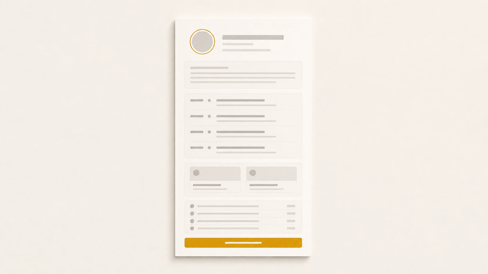
One page serves all three if you order it by descending universality: the things everyone needs first, the things only some readers want lower down. That order is the anatomy.
1. Header. Your name, a one-line headline that says what you do and for whom, and a photo. This is the five-second block. The headline is the most important line on the page. "Operational due diligence for lower-mid-market PE" tells a reader exactly who you are; "Strategic Leader | Problem Solver | Lifelong Learner" tells them you didn't decide. Put a contact affordance here too, a button, so the reader who is already convinced doesn't have to hunt for it later.
2. About. Two to four sentences: what you do, who you do it for, and what you are open to. Not a life story. The about gives the headline context and states, plainly, what you want to happen next ("open to senior backend roles," "available for fractional CFO engagements"). A reader who knows what you want can decide faster whether they have it.
3. Resume or credentials. Your experience, structured: roles, dates, what you did, the outcomes. This is the block the recruiter came to verify and the one the hiring manager reads against the job. It can be the resume itself, embedded, or a web rendering of the same career data. Either way it is structured, roles with dates, not a paragraph of prose, because the reader is scanning for a shape they recognize. For how to write this part well, the resume guide is the reference.
4. Selected work. One to three examples, each with context. This is the block the hiring manager scrolls for and the one a resume cannot carry. Conventions are below; the short version is depth over breadth.
5. Links. A curated, named set of places to see more: your code, your writing, your longer portfolio, your LinkedIn. Named and ordered, never a wall of bare URLs. Conventions below.
6. Contact. A way to reach you that a person can use in one click and a scraper cannot harvest in bulk. Discoverable, not exposed. Conventions below.
That order is not arbitrary. It front-loads what every reader needs (who are you, are you relevant, what have you done) and defers what only some readers want (deep examples, links to more, the contact step they take once convinced). The recruiter gets their answer without scrolling. The hiring manager scrolls into the examples. The peer follows the links. Nobody has to dig for the thing they came for.
The links section: named, ordered, curated
The links block is where most hub pages quietly fail, because it is the part that looks like a biolink and tempts you to treat it like one. A biolink can afford to be a long list; its job is to offer the follower every possible next click. Your hub page's links block has the opposite job: to send a serious reader to the two or three places that will most raise their estimate of you, and to leave the rest off.
Name every link; never show a bare URL. "github.com/your-handle" is a string the reader has to decode. "My open-source work, mostly Rust and infra tooling" is a reason to click. The name is where you tell the reader what they will find and why it is worth their time. A bare URL wastes the one chance you have to frame the destination.
Order by relevance to the reader, not by recency or habit. The first link should be the one that most helps the reader you most want. For a job seeker, that is usually the work sample closest to the role; for a consultant, the case study closest to the buyer's problem. LinkedIn belongs near the bottom, not the top. The reader can find your LinkedIn anywhere, and it is rarely the thing that changes their mind.
Curate hard. Eight strong links beat thirty. Every weak link dilutes the strong ones and spends the reader's attention. If a link does not earn its place (an abandoned Medium with two posts, a Dribbble you have not touched in three years), cut it. A short, sharp set reads as someone who knows what matters; a long one reads as someone who could not decide.
Check them, and keep checking. A dead link is worse than a missing one, because it tells the reader the page is unmaintained, and an unmaintained page makes every other claim on it suspect. The link to the talk that 404s undoes the headline that impressed them.
The selected-work section: one to three, worked
The examples block is where a hub page earns the visit, and the most common mistake is volume. A portfolio of thirty thumbnails is not impressive; it is a request that the reader do the work of finding the good one, and they will not. Show one to three examples, chosen because they are the strongest evidence for the work you want next, and give each one enough context to land.
A worked example has four parts, and each fits in a sentence or two:
- What it was. The project, the problem, the context. "A payments team at a Series B fintech needed to cut settlement time without a full rewrite."
- What you did. Your role and the specific decisions. Not "was involved in," but the thing you owned. "I designed the outbox-based deferred-write pattern and led the four-week migration."
- What happened. The outcome, with a number where you have one. "Settlement dropped from 40 minutes to six, with zero double-writes in the first quarter."
- Where to see more. A link to the case study, the repo, the deck, or the live thing, named per the rules above.
Three examples in that shape tell a reader more than thirty thumbnails, because each one proves you can do a specific thing and shows how. Thumbnails prove you have done a volume of things and explain none of them.
A note for anyone whose best work is confidential. Consultants, agency staff, and people at private companies often can't name the client or show the artifact. Anonymize to the level you are cleared for: "a Series B fintech" instead of the name, the shape of the result instead of the exact figure. The reader does not need the logo; they need to believe the work happened and that you did the part you claim. Vague anonymization ("a leading company") reads as evasive; specific anonymization ("a 40-person Series A in healthcare logistics") reads as real.
If your field is visual (design, photography, architecture) the thumbnail instinct is stronger and partly right: the reader does want to see the work. Even then, lead with three pieces given real context, and link out to the full gallery for the reader who wants volume. The hub page is the curated front; the gallery is the archive behind it. Don't put the archive on the front.
The contact section: discoverable, not exposed
The contact block has two failure modes, and most people pick one of them. Either they hide contact entirely (a hub page with no way to reach the person, which defeats the purpose), or they paste their raw email in plain text at the top, where it works for the reader and equally well for every scraper bot that indexes the page and sells the address to spammers.
The target is in between: discoverable, not exposed. A reader who wants to reach you should be able to in one click. A bot scraping the page text should come away with nothing usable.
A few ways to hit it:
- A contact form. The reader fills it, the message reaches you, and your address never appears on the page. The most robust option, and the one most hub-page tools provide.
- A button, not a string. A "Contact" or "Email me" button with the address behind a mailto, rather than the address typed into the page body. A person clicks through; a naive scraper reading text finds nothing.
- One reliable channel, not five. You do not need to list email, phone, three social DMs, and a calendar link. Pick the channel you actually monitor and offer that. A reader wants one obvious way to reach you, not a menu to choose from.
What to avoid: your phone number in plain text (you will get sales calls), your personal email as raw text in the body (you will get spam), and a contact section so coy the reader cannot tell how to reach you at all. The point of the page is to start conversations. Make the last step the most reliable one, not the hardest.
One page, and keep it current
Two disciplines separate a hub page that works from one that becomes the dated link at the bottom of your search results.
The first is one page, not a sprawl. The temptation is to keep adding (a blog, a now page, a reading list, a photo gallery) until the hub is a small website with a navigation bar and the reader's five-second decision is buried under your hobbies. Resist it. The hub page is a single scroll with a clear job. If a section does not help a stranger decide whether to talk to you, it belongs somewhere else, or nowhere.
The second is currency, which is harder, because a hub page goes stale exactly when you are busiest: a new job, a new project, a move. The observation from the pillar holds: most people build a professional page in the first months of a job change and let it rot by month six. A stale page is a liability, because it actively contradicts the current you a recruiter finds everywhere else.
The structural fix is to not maintain the page as a separate thing. If your hub page, your resume, and the PDF you submit all draw from one set of career data, then updating your most recent role once refreshes all of them, and the page cannot drift out of sync with the resume because they are the same data rendered two ways. This is the model ProPage is built on: your resume (which also exports the ATS-safe PDF that applications still ask for) and your hub page of links and work live under one identity at pro.page/yourname, updated in one place. The hub page itself stays web-only by design, because a page of links and live examples is a web artifact; the paper export is the resume's job, not the hub's.
Whatever tool you use, the test is the same: when you change jobs, how many places do you have to update? If the answer is more than one, the page will eventually disagree with you, and a page that disagrees with you is worse than no page.
Build it once, for the reader
A professional hub page is not a creative project, though it can look like one. It is an answer, written in advance, to a question strangers keep asking: who is this, and are they worth my time? You build it once, in the order a reader needs, with the work shown and the contact reachable, and then it answers that question for you, correctly, every time someone searches your name, without you in the room.
For the page's reason to exist, the professional identity URL guide is the argument in full. For the resume the page should carry and export, see How to write a resume in 2026 and, for the version a parser reads, ATS-friendly resume formats. For which tool to build the page on, the comparison of Linktree alternatives for professionals lays out the options.
Build the page once. Order it for the reader. Keep it current. The rest is what you put on it.